And so another gleaming Copenhagen August came and went, with its neat little string of events: first a fashion week doing its utmost to manufacture glamour for a sun-kissed, Scandi-homogenous influencers clad in brand-new desert-coloured clobber; then a Pride week of, naturally, boundless importance (met with conspicuous event silence from the art institutions that otherwise gleefully throw themselves at every conceivable commercial design partnership – but that’s a discussion for another day). And then, as a kind of culmination of this gregarious month of chatter, the Chart and Enter art fairs, which, for reasons apparently involving some internal squabbling, do not join forces but instead occupy opposite ends of the city. If you want to buy art, by all means check them out; if not, you can happily skip both and enjoy the fact that, for the benefit of the international clientele such fairs fly in, plenty of exhibitions invariably open in time for this particular weekend of shopping.
This year is no exception. Three Copenhagen galleries have, each in their own way, facilitated little glimpses of the world beyond the city’s inner districts: Christian Andersen is showing New York-based Gianna Surangkanjanajai; at Lagune Ouest we find Mille Qvist, Danish but based in Hamburg; and Andersen’s Contemporary presents a collaboration between Swiss artist Sylvie Fleury and the increasingly international Copenhagener Esben Weile Kjær.
The three exhibitions could hardly be more different: Surangkanjanajai’s inward-looking photographs; Qvist’s sleek minimal sculptures seasoned with a readymade approach and Fleury and Weile Kjær, blasting proud, unapologetic pop into the gallery space. Yet when viewed over the course of a couple of sun-drenched event days, the three very different idioms in the three very different spaces are somehow interwoven through their variations on surface. It feels important to distinguish between surface and superficiality – and to stress that superficiality is not necessarily a term of abuse. Surangkanjanajai and Weile Kjær’s work probably occupy the most distant ends of a spectrum, but this is also a spectrum of surface.

At Christian Andersen, three airy rooms are given over to Surangkanjanajai’s works, which in all their hushed, knowing inwardness are perhaps about as far from superficiality as you can get. No exhibition title, no text, no labels, Untitled works only: two sculptures and a series of photographs hung Tillmans-style with a couple of nails straight into the wall. The images are installation shots from the artist’s previous shows in Brussels, Bonn, Milan, and so on, but the actual artworks have been Photoshopped out, leaving a ghostly imprint of emptiness in the photographed spaces. As a wholehearted opponent of art institutions’ compulsory mediation, I am always up for a textless exhibition, but despite the surely intentionally discrete concept, these works seems to actually want – and would probably benefit from – a bit of decoding. Three sentences or some title hints might have been useful, but you can, of course, also ask the gallerist and get good answers.
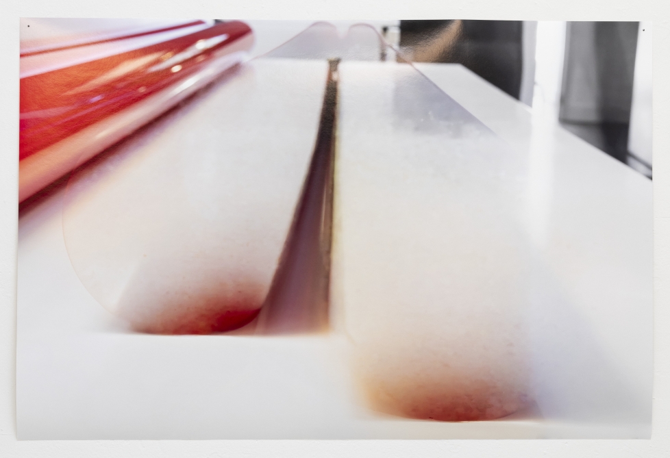
The images are images of absence, of much-acclaimed white cubes with beautiful floors, of those blurry, melted outlines that betray prompted digital manipulation. Above all, they feel like genuinely understated if-you-know-you-know art. A tasteful translation of already subtle sculptures into the far less monumental medium of photography. At the same time, the photographs are printed on paper of conspicuously exquisite quality: a grey floor in one picture looks almost as architectural as Christian Andersen’s actual floor; restrained mother-of-pearl-like shades appear in images of white walls; something red turns as glossy as a yuppie’s car bonnet. Overall, there’s an extraordinary amount of delicious analogue texture in these images, despite their presumably long and layered digital genealogy.
This muted glossiness seems relevant to the ideas about surface outlined above. The degree of insider knowledge that Surangkanjanajai’s works exude is in many ways the antithesis of superficiality, yet there is also a more coquettish engagement with surface at play in the decision to erase one’s own works from existing photographs and then print those erasures large scale on luxurious photographic paper. It’s not that a preoccupation with surface compromises the works’ substance. Rather, it offers a way of engaging with the often unequivocal beauty of surfaces on the artist’s own understated terms.
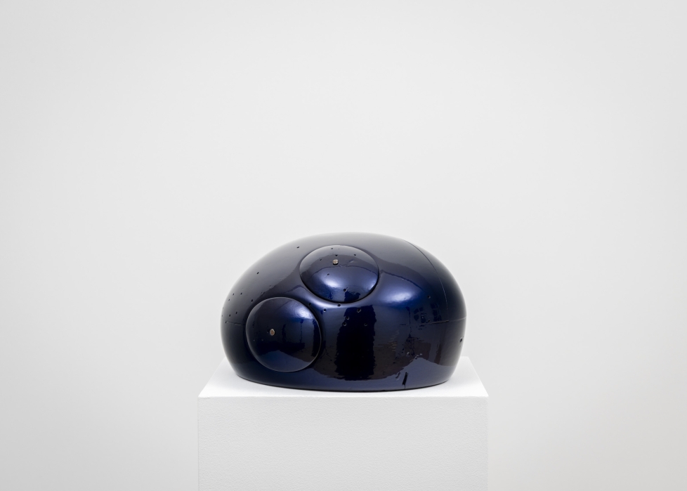
Qvist’s sculptures are likewise full of a sense of surrender to surface, perhaps more literally because they involve lacquer and latex. Four midnight-hued, science-fiction-like objects sit on plinths. They resemble mechanical heads or miniature spacecraft, but beneath the lacquer they are so-called ‘hat blocks’: head-shaped pieces of wood used by milliners in the refined, hands-on craft of hat-making. Coating them in a popping, cosmic-blue automotive paint forms an obvious contrast to the emphatically analogue, grounded, and rather decadent craft tradition of millinery. It is a fairly intense treatment of an already excellent sculptural object, making function more secondary and surface more primary: a kind of shift in medium from material to motif.
And when a sheet of matte latex is placed on a bench-like sculpture like an empty cushion cover, it conceals, in more ways than one, the sculptural traditions Qvist is simultaneously invoking and defying. There are traces of the readymade and monolithic Minimalism in her work, but it is all wrapped in lacquer and latex. These gestures might be read as small deadpan nods to caricatured surfaces of desire, but they also feel like subtler negotiations of how surface can operate as an element in its own right within a sculptural logic. First come the object, the narrative, the history, the gravity, perhaps the function; then on top – literally – comes the delicious add-on.
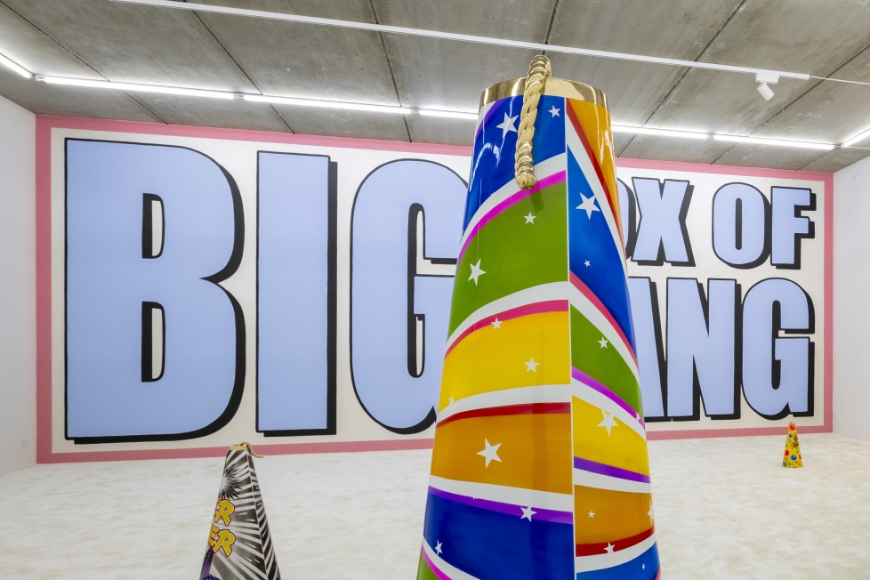
Finally, with Sylvie Fleury and Esben Weile Kjær, we arrive at the genuinely and intentionally superficial kind of surface. For their collaborative works, they have enlarged small packets of children’s fireworks, cast them as bronze cones (some up to human height), and done everything possible to disguise the bronze. The sculptures look like cardboard or enamel; there is a candy-like glossiness to the exploding packaging aesthetic. All of this is surely deliberate, but the use of bronze feels nakedly commercial. And however comfortably this kind of material superficiality sits within two practices dedicated to hyper-legible glitter-pop, it remains a slightly peculiar extravagance. There is a sense that the sculptures do not really want to be anything other than expensive surfaces masquerading as fairground tat.
There can be no doubt that the wheels of commerce are set in motion for the benefit of the art-fair clientele, and so be it. But Fleury and Weile Kjær’s engagement with flashy surfaces is so uninhibited that I find myself wondering whether it springs from anything more than a longing – within the artists and collectors alike – for something shiny. Presumably it does, but it is difficult to discern much substance beyond the top layers of bubblegum cheerfulness and the money to be made from the bronze core. Which may, of course, be precisely the point. What does pop want more than to reach for the tastiest emotions at the very top of the hierarchy of needs?
And what can event-hungry audiences possibly want more from August than kisses on cheeks and aimless banter below the last pink-hued evening skies, while summer ends and art fairs arrive and surfaces remain irresistibly eye-catching to all the aesthetes of the city and the world. It does, however, make sense to take a proper look at them.
Translated from Danish